Have you ever been stuck in an airport because your flight was delayed or cancelled and wondered if you could have predicted it if you’d had more data? This is your chance to find out.
- Part 1. Constructing database
- Part 2. Basic Questions
- Part 3. Advanced Questions
Part 1. Constructing database
## Prerequisite ----
library(readr)
library(dplyr)
library(RSQLite)

## Connect ----
con = dbConnect(SQLite(), "project.sqlite")

## Question 2 ----
dbWriteTable(con, "airlines",
             read_csv("./data/airlines.csv",
                      locale = locale(encoding = "UTF-8"), skip = 1))
dbWriteTable(con, "airports",
             read_csv("./data/airports.csv",
                      locale = locale(encoding = "UTF-8"),
                      col_names = c("Airport ID", "Name", "City", "Country", "IATA",
                                    "ICAO", "Latitude", "Longitude", "Altitude", "Timezone",
                                    "DST", "Tz database time zone", "Type", "Source")))
dbWriteTable(con, "airplanes",
             read_csv("./data/airplanes.csv",
                      locale = locale(encoding = "UTF-8")))

## Question 3 ----
for(year in 2001:2018){
  for(month in 1:12){
    filename = paste("./data/", year, sprintf("%02d", month), ".zip", sep = "")
    filedata = read_csv(filename, locale = locale(encoding = "UTF-8"))
    dbWriteTable(con, "flights", filedata, append = TRUE)
  }
}

## Question 4 ----
dbSendQuery(con, "CREATE INDEX date ON flights (Year, Month, Day_of_Month)")

## Disconnect ----
dbDisconnect(con)
Part 2. Basic Questions
Sys.setlocale("LC_ALL", "English")
library(RSQLite)
library(tidyverse)
library(lubridate)
library(ggrepel)
con = dbConnect(SQLite(), "project.sqlite")
Q1. Monthly traffic in three airports
-
We first start by exploring the airports table. Using
dplyr::filter(), find out which airports the codes “SNA”, “SJC”, and “SMF” belong to.SNA.SJC.SMF = dplyr::tbl(con, "airports") %>% filter(IATA %in% c("SNA", "SJC", "SMF")) %>% collect() %>% print(width = Inf)## # A tibble: 3 x 14 ## `Airport ID` Name City ## <dbl> <chr> <chr> ## 1 3748 Norman Y. Mineta San Jose International Airport San Jose ## 2 3817 Sacramento International Airport Sacramento ## 3 3867 John Wayne Airport-Orange County Airport Santa Ana ## Country IATA ICAO Latitude Longitude Altitude Timezone DST ## <chr> <chr> <chr> <dbl> <dbl> <dbl> <dbl> <chr> ## 1 United States SJC KSJC 37.4 -122. 62 -8 A ## 2 United States SMF KSMF 38.7 -122. 27 -8 A ## 3 United States SNA KSNA 33.7 -118. 56 -8 A ## `Tz database time zone` Type Source ## <chr> <chr> <chr> ## 1 America/Los_Angeles airport OurAirports ## 2 America/Los_Angeles airport OurAirports ## 3 America/Los_Angeles airport OurAirports코드가 “SNA”, “SJC”, “SMF”인 공항은 각각 John Wayne Airport-Orange County Airport, Norman Y. Mineta San Jose International Airport, Sacramento International Airport였다.
-
Aggregate the counts of flights to all three of these airports at the monthly level (in the flights table) into a new data frame
airportcounts. You may finddplyrfunctionsgroup_by(),summarise(),collect(), and the pipe operator%>%useful.airportcounts = dplyr::tbl(con, "flights") %>% filter(Cancelled == 0) %>% select(Year, Month, Dest) %>% group_by(Year, Month) %>% summarise(SNA = sum(Dest == "SNA", na.rm = TRUE), SJC = sum(Dest == "SJC", na.rm = TRUE), SMF = sum(Dest == "SMF", na.rm = TRUE)) %>% ungroup() %>% collect() %>% print(width = Inf)## # A tibble: 216 x 5 ## Year Month SNA SJC SMF ## <dbl> <dbl> <int> <int> <int> ## 1 2001 1 3561 6144 3261 ## 2 2001 2 3183 5532 2902 ## 3 2001 3 3560 6221 3322 ## 4 2001 4 3467 6090 3274 ## 5 2001 5 3660 6381 3411 ## 6 2001 6 3673 6293 3443 ## 7 2001 7 3860 6540 3655 ## 8 2001 8 3927 6585 3680 ## 9 2001 9 2883 4732 2846 ## 10 2001 10 3465 5533 3342 ## # ... with 206 more rows -
Add a new column to airportcounts by constructing a
Datevariable from the variablesYearandMonth(using helper functions from thelubridatepackage). Sort the rows in ascending order of dates.airportcounts = airportcounts %>% mutate(Date = make_date(Year, Month, 1)) %>% arrange(Date) %>% print(width = Inf)## # A tibble: 216 x 6 ## Year Month SNA SJC SMF Date ## <dbl> <dbl> <int> <int> <int> <date> ## 1 2001 1 3561 6144 3261 2001-01-01 ## 2 2001 2 3183 5532 2902 2001-02-01 ## 3 2001 3 3560 6221 3322 2001-03-01 ## 4 2001 4 3467 6090 3274 2001-04-01 ## 5 2001 5 3660 6381 3411 2001-05-01 ## 6 2001 6 3673 6293 3443 2001-06-01 ## 7 2001 7 3860 6540 3655 2001-07-01 ## 8 2001 8 3927 6585 3680 2001-08-01 ## 9 2001 9 2883 4732 2846 2001-09-01 ## 10 2001 10 3465 5533 3342 2001-10-01 ## # ... with 206 more rowslubridate::make_date()함수를 사용하여<date>type의 object를 생성하기 위해서는 year, month, day를 전부 지정해야 하기 때문에 임의로 1일에 day를 맞추었다. -
From
airportcounts, generate a time series plot that plots the number of flights per month in each of the three airports in chronological order.ggplot(data = airportcounts) + geom_line(mapping = aes(x = Date, y = SNA, colour = "purple")) + geom_line(mapping = aes(x = Date, y = SJC, colour = "orange")) + geom_line(mapping = aes(x = Date, y = SMF, colour = "green4")) + scale_color_identity(name = "IATA airport code", breaks = c("purple", "orange", "green4"), labels = c("SNA", "SJC", "SMF"), guide = "legend") + labs(x = "Date", y = "Number of flights") + scale_x_date(date_labels = "%Y %b", date_breaks = "1 years") + theme(axis.text.x = element_text(angle = 45), legend.position = "top")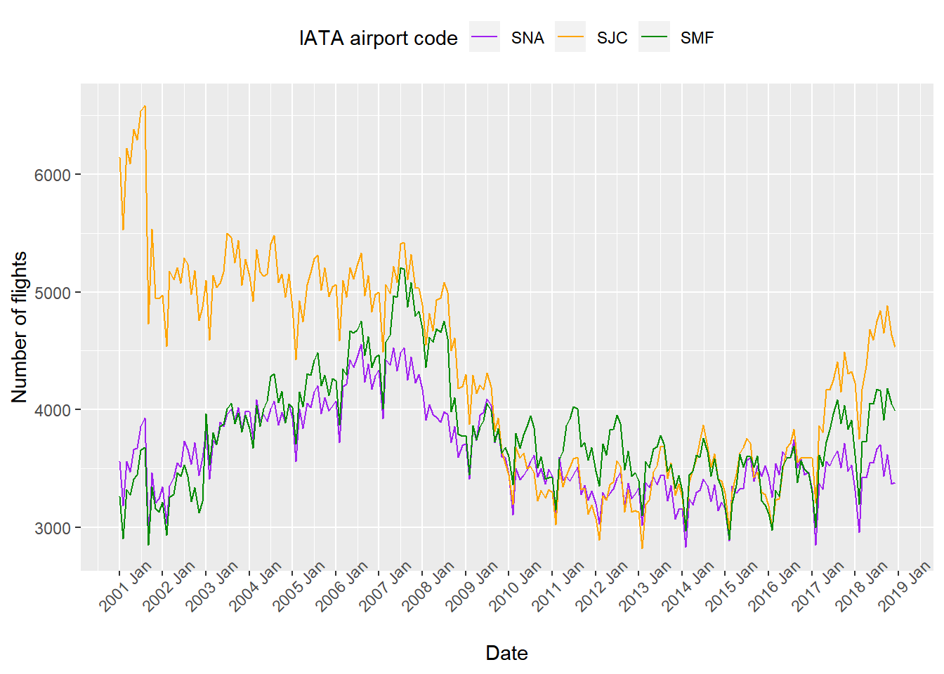
2007년 이전까지는 “SJC” 공항이 우위를 점했지만 이후에는 각 공항으로 향하는 항공편의 수가 거의 차이가 나지 않았다. 덧붙이면 겨울에는 항공편의 수가 줄었다가 여름에 다시 늘어나는 연주기성을 공통적으로 관찰할 수 있었다.
-
Find the top ten months (like 2001-09) with the largest number of flights for each of the three airports.
SNA = airportcounts %>% arrange(desc(SNA)) %>% .[1:10, ] SJC = airportcounts %>% arrange(desc(SJC)) %>% .[1:10, ] SMF = airportcounts %>% arrange(desc(SMF)) %>% .[1:10, ]paste(SNA$Year, sprintf("%02d", SNA$Month), sep = "-")## [1] "2006-08" "2007-08" "2007-05" "2007-07" "2007-10" "2006-07" "2006-05" ## [8] "2007-03" "2006-10" "2007-04"“SNA” 공항으로 향하는 항공편이 가장 많았던 상위 10개의 달은 2006-08, 2007-08, 2007-05, 2007-07, 2007-10, 2006-07, 2006-05, 2007-03, 2006-10, 2007-04이었다.
paste(SJC$Year, sprintf("%02d", SJC$Month), sep = "-")## [1] "2001-08" "2001-07" "2001-05" "2001-06" "2001-03" "2001-01" "2001-04" ## [8] "2001-10" "2001-02" "2003-07"“SJC” 공항으로 향하는 항공편이 가장 많았던 상위 10개의 달은 2001-08, 2001-07, 2001-05, 2001-06, 2001-03, 2001-01, 2001-04, 2001-10, 2001-02, 2003-07이었다.
paste(SMF$Year, sprintf("%02d", SMF$Month), sep = "-")## [1] "2007-07" "2007-08" "2007-10" "2007-05" "2007-06" "2007-09" "2007-12" ## [8] "2007-11" "2008-07" "2006-08"“SMF” 공항으로 향하는 항공편이 가장 많았던 상위 10개의 달은 2007-07, 2007-08, 2007-10, 2007-05, 2007-06, 2007-09, 2007-12, 2007-11, 2008-07, 2006-08이었다.
Q2. Finding reliable airlines
Which airline was most reliable flying from Chicago O’Hare (ORD) to Minneapolis/St. Paul (MSP) in Year 2015?
-
Create a data frame
delaysthat contains the average arrival delay for each day in 2015 for four airlines: United (UA), Northwest (NW), American (AA), and Delta (DL). Your data frame must contain only necessary variables, to save the memory space.delays = dplyr::tbl(con, "flights") %>% filter(Origin == "ORD", Dest == "MSP", Year == 2015, Op_Unique_Carrier %in% c("UA", "DL", "AA", "MQ"), Cancelled == 0) %>% select(Year, Month, Day_of_Month, Op_Unique_Carrier, Arr_Delay) %>% group_by(Year, Month, Day_of_Month, Op_Unique_Carrier) %>% summarise(Avg_Arr_Delay = mean(Arr_Delay, na.rm = TRUE)) %>% ungroup() %>% collect() %>% print(width = Inf)## # A tibble: 1,188 x 5 ## Year Month Day_of_Month Op_Unique_Carrier Avg_Arr_Delay ## <dbl> <dbl> <dbl> <chr> <dbl> ## 1 2015 1 1 AA 120. ## 2 2015 1 1 DL -12.5 ## 3 2015 1 1 MQ 2.33 ## 4 2015 1 2 AA -10.5 ## 5 2015 1 2 DL -1 ## 6 2015 1 2 MQ 3.33 ## 7 2015 1 3 AA 124. ## 8 2015 1 3 DL 48.5 ## 9 2015 1 3 MQ 20 ## 10 2015 1 4 AA 101. ## # ... with 1,178 more rows -
Compare the average delay of the four airlines by generating density plots comparing them in a single panel. In doing this, use a join function to provide the full names of the airlines in the legend of the plot. Which airline is the most reliable? Which is the least?
airlines = dplyr::tbl(con, "airlines") %>% collect()ggplot(data = left_join(delays, airlines, by = c("Op_Unique_Carrier" = "Code"))) + geom_density(mapping = aes(x = Avg_Arr_Delay, fill = Description, colour = Description), alpha = 0.1) + labs(x = "Average arrival delay (min)", y = "Density", fill = "Airlines", colour = "Airlines", caption = "Flights from Chicago O’Hare (ORD) to Minneapolis/St. Paul (MSP) in Year 2015") + scale_x_continuous(minor_breaks = seq(-20, 200, 10)) + theme(legend.position = "top")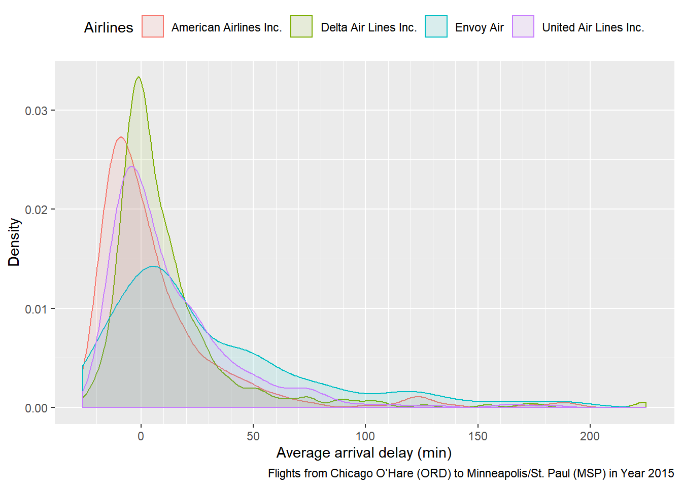
평균 지연 시간에 대한 평균과 분산이 전부 작아야 좋은 항공사이다. 따라서 플랏에 나타난 곡선의 폭이 좁을 뿐만 아니라 왼쪽으로 몰린 American Airlines Inc.가 가장 신뢰할 만하며 곡선의 폭이 가장 넓은 Envoy Air는 믿을 만 하지 못하다는 결론을 내릴 수 있었다.
Q3. All flights
-
Plot the count of all flights on Mondays in the year 2001. Explain the pattern you find in the visualization.
 Monday2001 = dplyr::tbl(con, "flights") %>%
   filter(Year == 2001, Day_Of_Week == 1, Cancelled == 0) %>%
   select(Year, Month, Day_of_Month) %>%
   group_by(Year, Month, Day_of_Month) %>%
   count() %>%
   ungroup %>%
   collect() %>%
   mutate(Date = make_date(Year, Month, Day_of_Month))
Monday2001Label = Monday2001 %>% mutate(lag_n = lag(n), lead_n = lead(n), before = lag_n - n, after = lead_n - n) %>% filter(row_number(desc(before)) < 5 | row_number(desc(after)) < 5)ggplot(data = Monday2001, mapping = aes(x = Date, y = n)) + geom_point() + geom_line() + scale_x_date(date_labels = "%b %d", date_breaks = "1 months", minor_breaks = NULL) + labs(y = "Number of all flights on Mondays in 2001") + geom_point(colour = "red", data = Monday2001Label) + geom_label_repel(data = Monday2001Label, mapping = aes(label = as.character(Date)))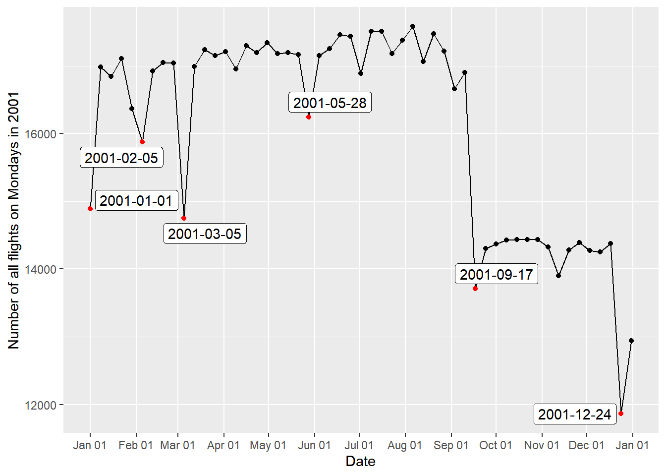
December = dplyr::tbl(con, "flights") %>% filter(Cancelled == 0, Month == 12) %>% group_by(Year, Day_of_Month) %>% summarise(n = n()) %>% group_by(Day_of_Month) %>% summarise(n = mean(n)) %>% collect()ggplot(data = December, mapping = aes(x = Day_of_Month, y = n)) + geom_point() + geom_line() + labs(x = "Day of December", y = "Number of flights") + scale_x_continuous(breaks = seq(1, 31, 1), minor_breaks = NULL)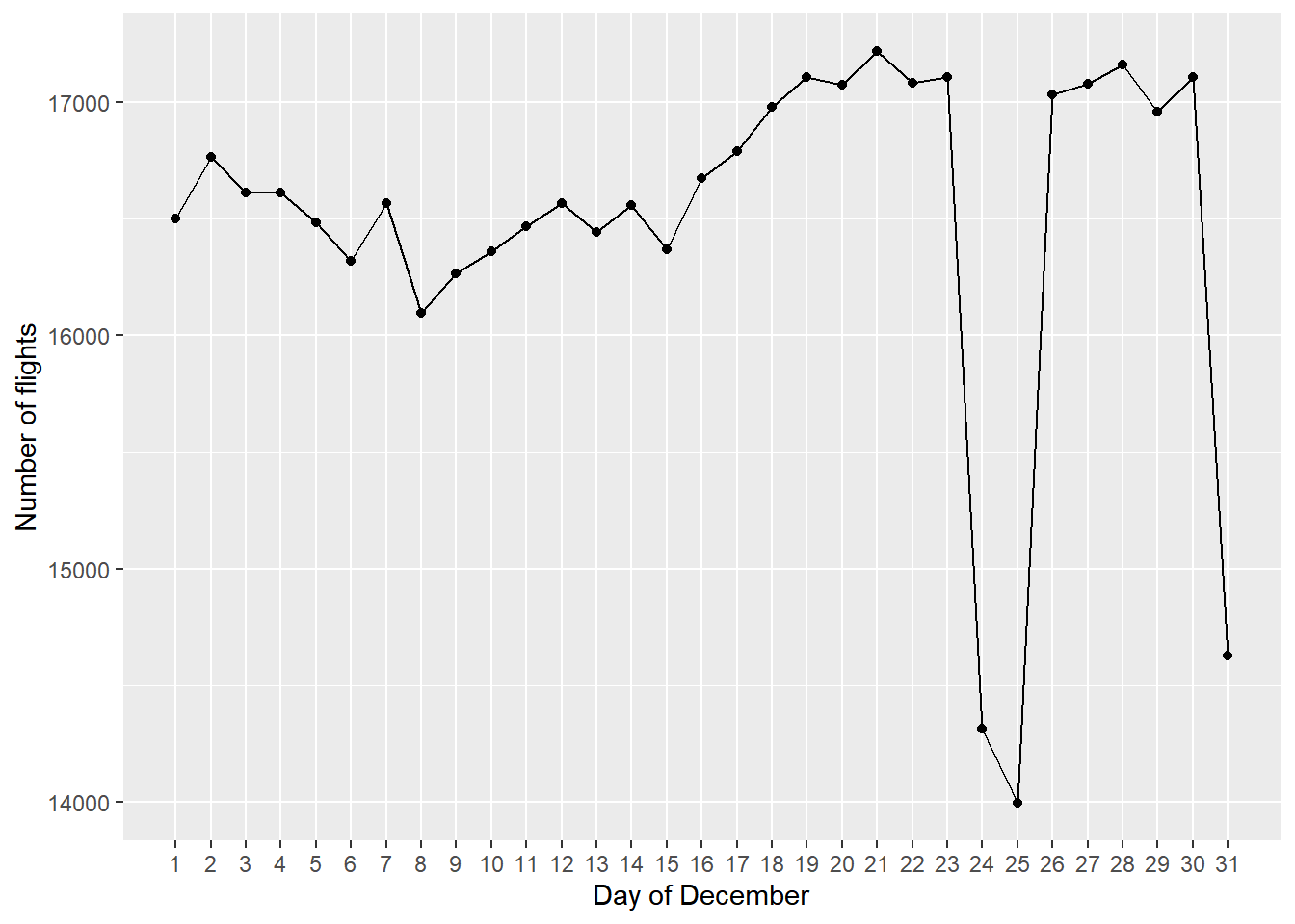
항공편의 수가 큰 폭으로 변동하는 시점을 한눈에 알아볼 수 있게 하기 위해서
Monday2001Label테이블을 생성한 뒤geom_label_repel()함수를 적용했다. 먼저 9월 17일에 항공편의 수가 급락하여 2001년 말까지 회복되지 않은 것이 눈에 띈다. 이는 2001년 9월 11일에 발생한 최악의 항공기 테러의 영향을 받은 것으로 생각된다. 이를 감안해도 12월 24일에는 유난히 항공편의 수가 적었는데December테이블에 12월의 각 일마다 연별 평균 항공편의 수를 집계하여 플랏팅한 결과 휴일이거나 휴일 근방인 12월 24일, 25일, 31일에는 항상 항공편의 수가 줄어들었다는 사실을 확인할 수 있었다. 한편, 미국에서 5월의 마지막 Monday는 공휴일인 Memorial Day이며 1월 1일 역시 공휴일인 New Years Day이다. 연휴 기간에는 항공편의 수가 줄어든다는 것을 일반화한다면 1월 1일과 Memorial Day인 5월 28일에 있었던 일시적인 하락 역시 설명할 수 있을 것으로 생각한다. 3월 5일의 하락은 북동부 지역에 있었던 폭설에 영향을 받았던 듯 하지만flights데이터에서 결항 이유를 나타내는Cancellation_Code의 값은 2003년부터 제공되기 때문에 정확히 검증할 수는 없었다. -
Repeat 1 for the year 2011.
 Monday2011 = dplyr::tbl(con, "flights") %>%
   filter(Year == 2011, Day_Of_Week == 1, Cancelled == 0) %>%
   select(Year, Month, Day_of_Month) %>%
   group_by(Year, Month, Day_of_Month) %>%
   count() %>%
   ungroup %>%
   collect() %>%
   mutate(Date = make_date(Year, Month, Day_of_Month))
Monday2011Label = Monday2011 %>% mutate(lag_n = lag(n), lead_n = lead(n), before = lag_n - n, after = lead_n - n) %>% filter(row_number(desc(before)) < 5 | row_number(desc(after)) < 5)ggplot(data = Monday2011, mapping = aes(x = Date, y = n)) + geom_point() + geom_line() + scale_x_date(date_labels = "%b %d", date_breaks = "1 months", minor_breaks = NULL) + labs(y = "Number of all flights on Mondays in 2011") + geom_point(colour = "red", data = Monday2011Label) + geom_label_repel(data = Monday2011Label, mapping = aes(label = as.character(Date)))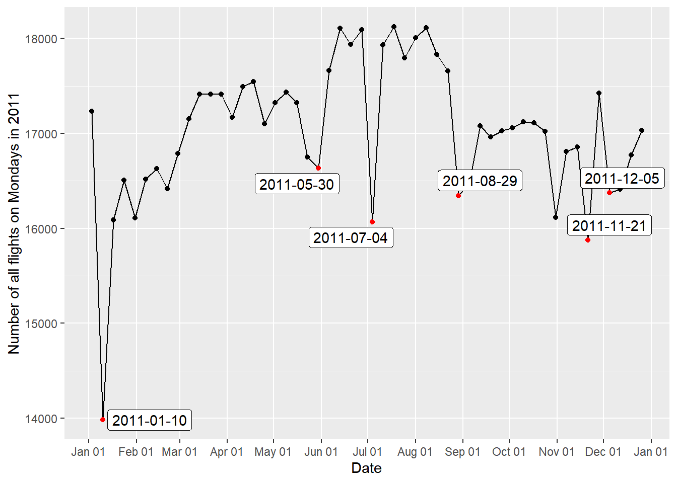
July = dplyr::tbl(con, "flights") %>% filter(Cancelled == 0, Month == 7) %>% group_by(Year, Day_of_Month) %>% summarise(n = n()) %>% group_by(Day_of_Month) %>% summarise(n = mean(n)) %>% collect()ggplot(data = July, mapping = aes(x = Day_of_Month, y = n)) + geom_point() + geom_line() + labs(x = "Day of July", y = "Number of flights") + scale_x_continuous(breaks = seq(1, 31, 1), minor_breaks = NULL)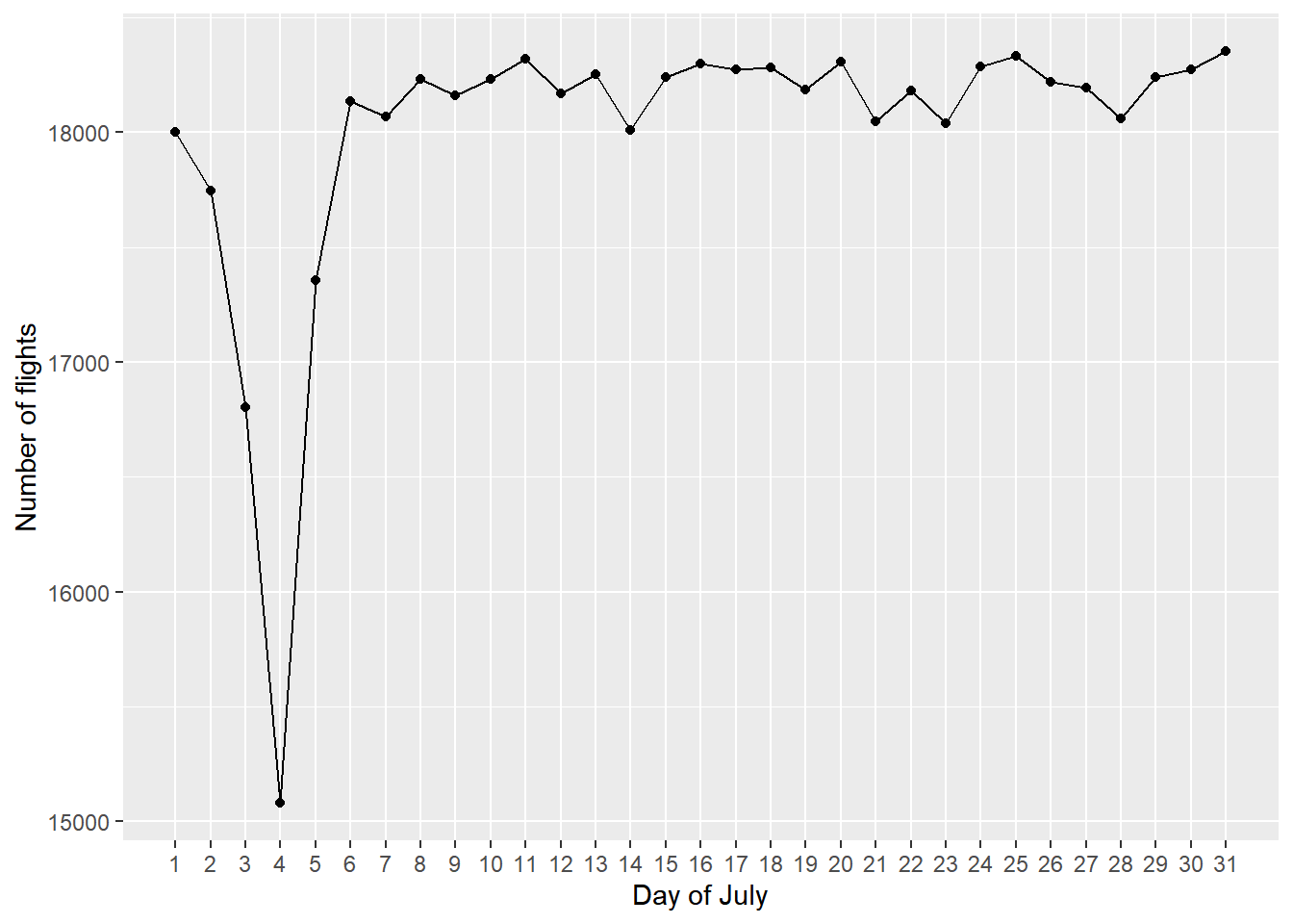
Monday2011Cancelled = dplyr::tbl(con, "flights") %>% filter(Year == 2011, Day_Of_Week == 1, Cancelled == 1) %>% select(Year, Month, Day_of_Month, Cancellation_Code) %>% collect() %>% mutate(Date = make_date(Year, Month, Day_of_Month))ggplot(data = Monday2011Cancelled) + geom_bar(mapping = aes(Date, fill = Cancellation_Code), position = "stack") + scale_x_date(date_labels = "%b %d", date_breaks = "1 months", minor_breaks = NULL) + scale_fill_discrete(labels = c("Carrier", "Weather", "NAS", "Securitry")) + labs(y = "Number of flights", fill = "Reason for cancellation") + theme(legend.position = "top")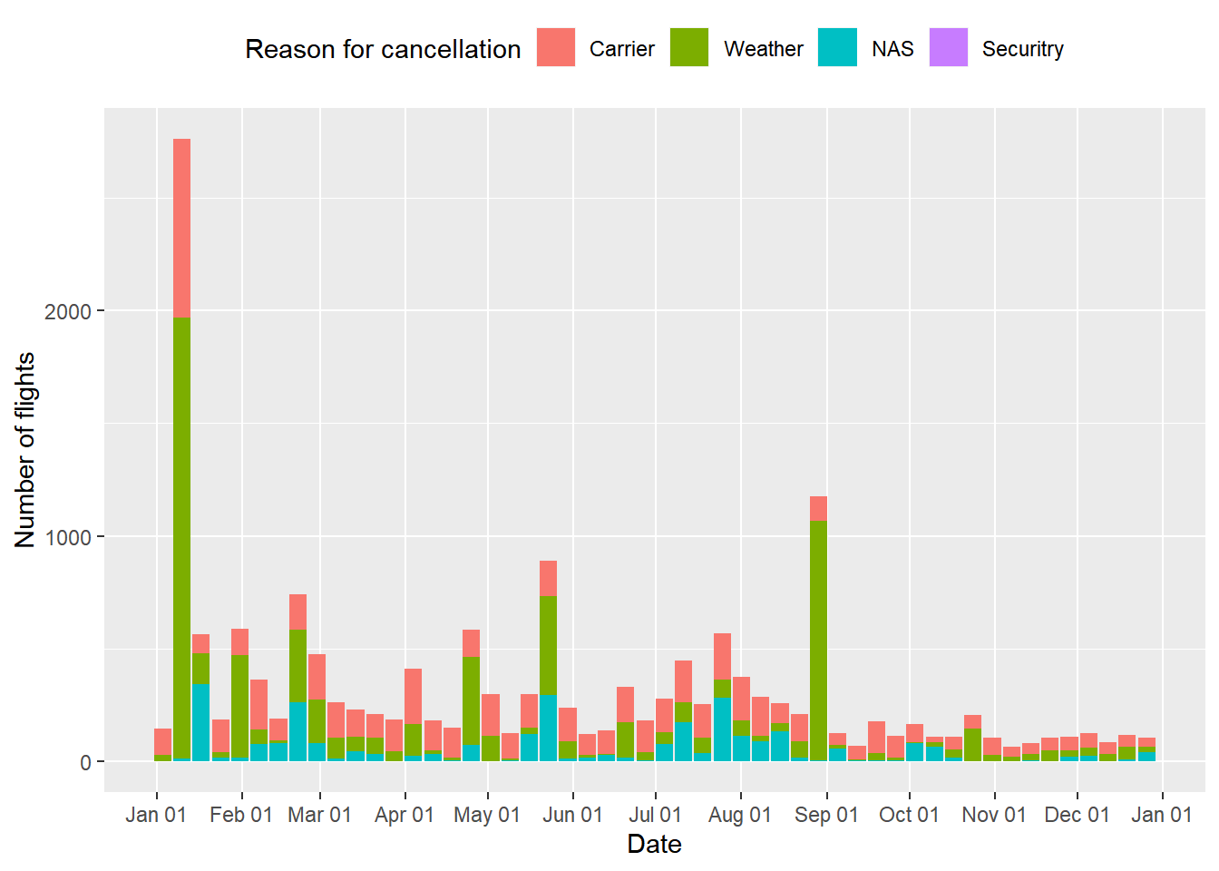
위에서와 같이 항공편의 수가 큰 폭으로 변동하는 시점을 한눈에 알아볼 수 있게 하기 위해서
Monday2011Label테이블을 생성한 뒤geom_label_repel()함수를 적용했다. 플랏팅 결과 휴가철인 여름에 항공편의 수가 전체적으로 증가하는 양상이었지만 7월 4일에만 갑자기 하락했다 회복된 점이 특이했다. 이유는 미국에서 7월 4일이 공휴일인 독립기념일이기 때문인 것으로 생각된다.July테이블을 생성하여 7월의 각 일마다 연별 평균 항공편의 수를 집계한 결과 실제 7월 4일을 전후하여 항공편의 수가 줄어듦을 확인할 수 있었다. 5월 30일의 경우는 위에서 확인했듯이 공휴일인 Memorial Day이기 때문에 항공편의 수가 줄어든 것으로 추론된다. 한편 1월 10일, 8월 29일에 항공편의 수가 급락한 까닭은 기상 악화인 것으로 여겨진다.Monday2011Cancelled라는 테이블을 생성하여 날짜별 결항 원인을 플랏팅한 결과 1월 10일, 8월 29일에는 날씨 때문에 대부분 결항이 발생했음을 알 수 있었다. 특히 낙폭이 가장 컸던 1월 10일 전후에는 미국에 매우 강한 눈폭풍이 발생했었다는 사실이 보고되어 있다.
dbDisconnect(con)
Part 3. Advanced Questions
Provide a graphical summary to answer the following questions. These are intentionally vague in order to allow you to focus on different aspects of the data. We only provide some suggestions.
Sys.setlocale("LC_ALL", "English")
library(RSQLite)
library(tidyverse)
library(lubridate)
library(scales)
library(gridExtra)
library(forcats)
library(maps)
library(ggrepel)
library(purrr)
library(modelr)
library(splines)
con = dbConnect(SQLite(), "project.sqlite")
Q1. When is the best time of day/day of week/time of year to fly to minimise delays?
Suggestions: cancelled flights do not possess delays. You may want to ignore negative delays.
Distribution of scheduled departure time and delays
delays.arrival = dplyr::tbl(con, "flights") %>%
  group_by(Arr_Delay) %>%
  summarise(n = n()) %>%
  collect()
delays.departure = dplyr::tbl(con, "flights") %>%
  group_by(Dep_Delay) %>%
  summarise(n = n()) %>%
  collect()
sched.dep.time = dplyr::tbl(con, "flights") %>%
  filter(Cancelled == 0) %>%
  group_by(CRS_Dep_Time) %>%
  summarise(n = n()) %>%
  mutate(sched_dep_time_m = ((CRS_Dep_Time %/% 100) %% 24)*60 + CRS_Dep_Time %% 100) %>%
  collect()
plot1A = ggplot(data = sched.dep.time) +
  geom_bar(mapping = aes(x = sched_dep_time_m, y = n), stat = "identity", width = 1/2) +
  scale_y_log10(labels = trans_format("log10", math_format(10^.x))) +
  scale_x_continuous(breaks = seq(0, 1440, 120)) +
  labs(x = "Scheduled departure time (min)", y = "Number of flights") +
  theme(axis.title.y = element_text(size = 8))
plot1B = ggplot(data = delays.arrival) +
  geom_bar(mapping = aes(x = Arr_Delay/60, y = n), stat = "identity", width = 1/120, fill = "purple") +
  scale_y_log10(labels = trans_format("log10", math_format(10^.x))) +
  coord_cartesian(xlim = c(-24, 48)) +
  scale_x_continuous(breaks = seq(-24, 48, 6)) +
  labs(x = "Arrival delays (hour)", y = "Number of flights") +
  theme(axis.title.y = element_text(size = 8))
plot1C = ggplot(data = delays.departure) +
  geom_bar(mapping = aes(x = Dep_Delay/60, y = n), stat = "identity", width = 1/120, fill = "orange") +
  scale_y_log10(labels = trans_format("log10", math_format(10^.x))) +
  coord_cartesian(xlim = c(-24, 48)) +
  scale_x_continuous(breaks = seq(-24, 48, 6)) +
  labs(x = "Departure delays (hour)", y = "Number of flights") +
  theme(axis.title.y = element_text(size = 8))
grid.arrange(plot1A, plot1B, plot1C, nrow = 3, ncol = 1)
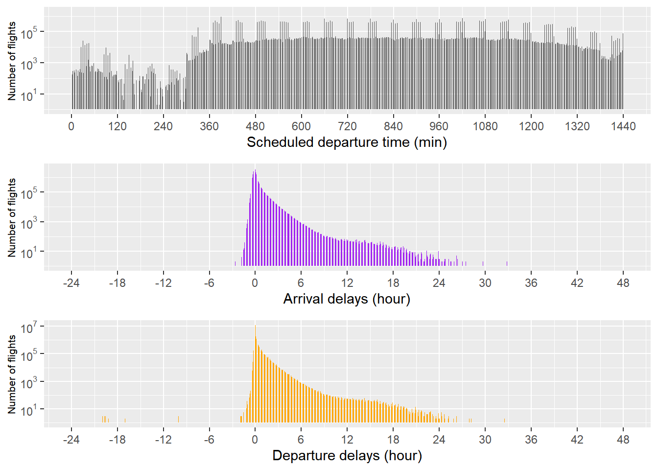
본격적인 분석에 들어가기에 앞서, 출발 예정 시각, 도착 지연 시간, 출발 지연 시간의 분포를 파악했다. 효과적인 시각화를 위해 로그 스케일의 플랏팅을 수행한 결과, 새벽 0시에서 5시 사이에 출발이 예정되어 있는 항공편은 매우 적었다. 도착 지연 시간과 출발 지연 시간의 경우 대부분이 0 근처에 몰려 있는 것과, 일찍 출발하는 경우가 일찍 도착하는 경우보다 희귀하다는 것을 관찰할 수 있었다.
The best time of day to fly to minimise delays
delays.timely = dplyr::tbl(con, "flights") %>%
  filter(Cancelled == 0, !is.na(CRS_Dep_Time)) %>%
  select(CRS_Dep_Time, Arr_Delay, Dep_Delay) %>%
  mutate(sched_dep_time_h = (CRS_Dep_Time %/% 100) %% 24) %>%
  group_by(sched_dep_time_h) %>%
  summarise(arr_on_time = mean(Arr_Delay <= 0, na.rm = TRUE), avg_arr_delay = mean(Arr_Delay[Arr_Delay > 0], na.rm = TRUE),
            dep_on_time = mean(Dep_Delay <= 0, na.rm = TRUE), avg_dep_delay = mean(Dep_Delay[Dep_Delay > 0], na.rm = TRUE)) %>%
  collect()
plot2A = ggplot(data = delays.timely, mapping = aes(x = sched_dep_time_h)) +
  geom_area(mapping = aes(y = (1 - arr_on_time)*100, alpha = 0.2), fill = "purple") +
  geom_line(mapping = aes(y = avg_arr_delay, colour = "purple")) +
  geom_point(mapping = aes(y = avg_arr_delay, colour = "purple")) +
  coord_cartesian(ylim = c(10, 60)) +
  scale_x_continuous(breaks = 0:23, minor_breaks = NULL) +
  scale_y_continuous(sec.axis = sec_axis(~., name = "")) +
  labs(x = "Scheduled departure time (hour)", y = "") +
  scale_alpha_identity(name = "", guide = "legend", labels = c("% of flights possess\narrival delays")) +
  scale_color_identity(name = "", breaks = c("purple"), guide = "legend", labels = c("Average arrival\ndelays (min)"))
plot2B = ggplot(data = delays.timely, mapping = aes(x = sched_dep_time_h)) +
  geom_area(mapping = aes(y = (1 - dep_on_time)*100, alpha = 0.2), fill = "orange") +
  geom_line(mapping = aes(y = avg_dep_delay, colour = "orange")) +
  geom_point(mapping = aes(y = avg_dep_delay, colour = "orange")) +
  coord_cartesian(ylim = c(10, 60)) +
  scale_x_continuous(breaks = 0:23, minor_breaks = NULL) +
  scale_y_continuous(sec.axis = sec_axis(~., name = "")) +
  labs(x = "Scheduled departure time (hour)", y = "") +
  scale_alpha_identity(name = "", guide = "legend", labels = c("% of flights possess\ndeparture delays")) +
  scale_color_identity(name = "", breaks = c("orange"), guide = "legend", labels = c("Average departure\ndelays (min)"))
grid.arrange(plot2A, plot2B, nrow = 2, ncol = 1)
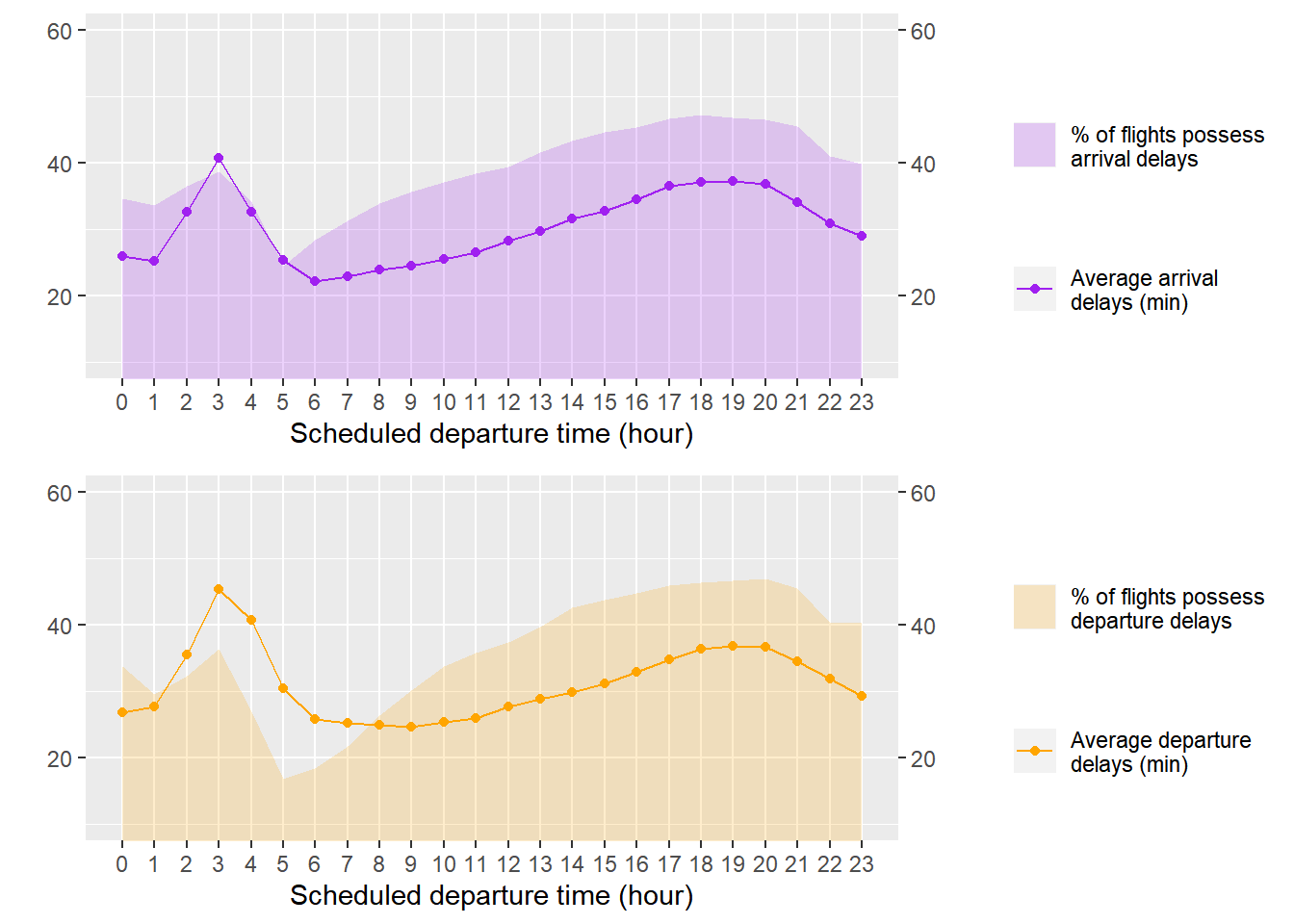
하루 중 지연을 최소로 할 수 있는 항공편의 출발 시간대를 찾기 위해, DB의 flights table에서 출발 예정 시각별 평균 지연 시간과 지연된 항공편 비율을 집계하여 delays.timely table에 저장했다. delays.timely에 대한 플랏팅 결과, 6시에서 8시 사이에 평균 지연 시간이 가장 작게 나타났다. 시간이 지날수록 평균 지연 시간과 지연된 항공편의 비율은 완만하게 증가하다 18시에서 20시 사이에 정점에 달했다. 따라서 아침에 출발하는 경우는 최대한 빨리 출발하고, 저녁에 출발하는 경우는 20시가 지난 늦은 밤이나 1시 이전의 이른 새벽에 출발하면 작은 지연 시간을 기대할 수 있다는 결론을 얻었다.
delays.daily.timely = dplyr::tbl(con, "flights") %>%
  filter(Cancelled == 0, !is.na(CRS_Dep_Time), Arr_Delay > 0, Dep_Delay > 0) %>%
  mutate(sched_dep_time_h = (CRS_Dep_Time %/% 100) %% 24) %>%
  group_by(Year, Month, Day_of_Month, sched_dep_time_h) %>%
  summarise(avg_arr_delay = mean(Arr_Delay, na.rm = TRUE),
            avg_dep_delay = mean(Dep_Delay, na.rm = TRUE)) %>%
  collect()
delays.daily.timely = delays.daily.timely %>%
  gather(avg_arr_delay, avg_dep_delay, key = "type", value = "avg_delay")
quantile(delays.daily.timely$avg_delay, probs = 0.9)
##     90%
## 55.0953
ggplot(data = delays.daily.timely %>% filter(sched_dep_time_h > 5, avg_delay < 60)) +
  geom_boxplot(mapping = aes(x =as_factor(sched_dep_time_h), y = avg_delay, colour = type)) +
  labs(x = "Scheduled departure time (hour)", y = "Average delays per day (min)") +
  scale_color_manual(values = c("purple", "orange"), label = c("Arrival", "Departure"), name = "") +
  theme(legend.position = "top")
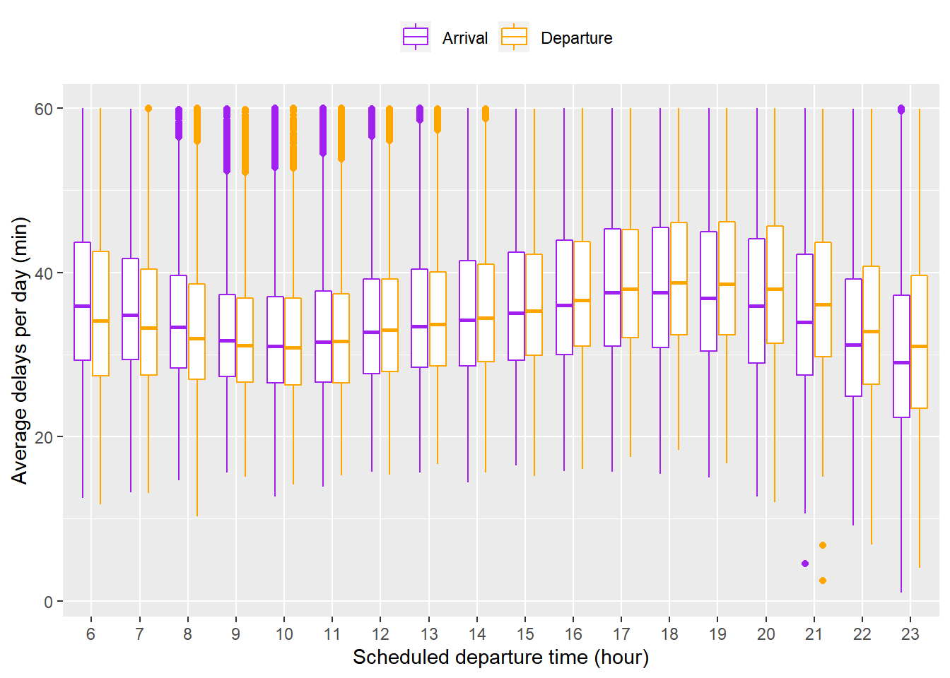
이전 플랏은 평균만을 나타낸다는 단점이 있다. 이를 극복하기 위해 DB의 flights table에서 출발 예정 시각마다 일별 평균 지연 시간을 집계하여 delays.daily.timely table에 저장한 뒤 geom_boxplot()을 적용하여 플랏팅했다. 매우 큰 이상치 때문에 중간값이 변하는 경향성이 잘 드러나지 않는 상황을 방지하기 위해 60분 이상의 평균 지연은 제외했다(평균 지연의 90%가 55분 이내임). 양상은 이전 플랏과 흡사하지만 일별 평균 지연 시간의 중간값과 IQR이 9 ~ 10시에 가장 작은 것과 해당 시간대를 벗어날수록 IQR이 점점 커지는 것이 관찰되었다. 이상의 논의를 종합하면 8시 이후 10시 이전의 이른 아침에 출발하는 것이 가장 좋을 것으로 생각된다.
The best day of week to fly to minimise delays
delays.daily = dplyr::tbl(con, "flights") %>%
  filter(Cancelled == 0) %>%
  group_by(Year, Month, Day_of_Month) %>%
  summarise(arr_on_time = mean(Arr_Delay <= 0, na.rm = TRUE),
            avg_arr_delay = mean(Arr_Delay[Arr_Delay > 0], na.rm = TRUE),
            dep_on_time = mean(Dep_Delay <= 0, na.rm = TRUE),
            avg_dep_delay = mean(Dep_Delay[Dep_Delay > 0], na.rm = TRUE)) %>%
  collect()
delays.daily = delays.daily %>%
  filter(!is.na(avg_arr_delay), !is.na(avg_dep_delay)) %>%
  mutate(Date = make_date(Year, Month, Day_of_Month), DoW = wday(Date, label = TRUE)) %>%
  select(Date, DoW, arr_on_time, dep_on_time, avg_arr_delay, avg_dep_delay)
plot3A = ggplot(data = delays.daily) +
  geom_boxplot(mapping = aes(x = reorder(DoW, (1 - arr_on_time)*100, FUN = median), y = (1 - arr_on_time)*100), fill = "purple", alpha = 0.2) +
  labs(x = "", y = "% of flights possess\narrival delays")
plot3B = ggplot(data = delays.daily) +
  geom_boxplot(mapping = aes(x = reorder(DoW, avg_arr_delay, FUN = median), y = avg_arr_delay), fill = "purple", alpha = 0.2) +
  labs(x = "", y = "Average arrival\ndelays per day (min)")
plot3C = ggplot(data = delays.daily) +
  geom_boxplot(mapping = aes(x = reorder(DoW, (1 - dep_on_time)*100, FUN = median), y = (1 - dep_on_time)*100), fill = "orange", alpha = 0.2) +
  labs(x = "", y = "% of flights possess\ndeparture delays")
plot3D = ggplot(data = delays.daily) +
  geom_boxplot(mapping = aes(x = reorder(DoW, avg_dep_delay, FUN = median), y = avg_dep_delay), fill = "orange", alpha = 0.2) +
  labs(x = "", y = "Average departure\ndelays per day (min)")
grid.arrange(plot3A, plot3B, plot3C, plot3D, nrow = 2, ncol = 2)
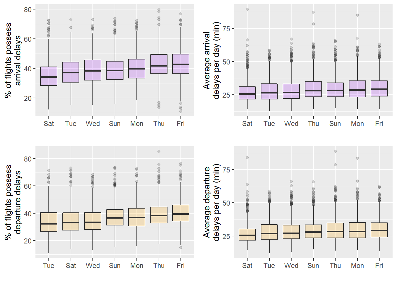
일주일 중 지연을 최소로 할 수 있는 요일을 알아내기 위해, DB의 flights table에서 일별 평균 지연 시간, 지연된 항공편의 비율을 집계하여 delays.daily table에 저장했다. 이에 geom_boxplot()과 reorder를 적용하여 요일별 플랏팅을 수행한 결과 토요일에 일별 평균 지연 시간 뿐만 아니라 도착이 지연된 항공편 비율에 대한 중간값과 IQR이 가장 작음을 확인할 수 있었다. 전반적으로 지연이 심한 요일은 금요일이었던 반면, 화요일과 수요일은 준수했다. 지연 시간이 작기를 바란다면 토요일, 화요일, 수요일에 출발하되 금요일은 피해야 한다.
The best time of year to fly to minimise delays
volume.origin.dest = dplyr::tbl(con, "flights") %>%
  filter(Cancelled == 0) %>%
  group_by(Origin, Dest) %>%
  summarise(n = n()) %>%
  arrange(desc(n)) %>%
  collect()
airports = dplyr::tbl(con, "airports") %>%
  collect()
volume.origin.dest = left_join(volume.origin.dest, airports, by = c("Origin" = "IATA")) %>%
  select(Origin, Dest, n, Origin_Lat = Latitude, Origin_Long = Longitude) %>%
  left_join(airports, by = c("Dest" = "IATA")) %>%
  select(Origin, Dest, n, Origin_Lat, Origin_Long, Dest_Lat = Latitude, Dest_Long = Longitude)
volume.origin = volume.origin.dest %>%
  group_by(Origin) %>%
  summarise(n = sum(n)) %>%
  arrange(desc(n))
ggplot(data = map_data("usa")) +
  geom_polygon(mapping = aes(x = long, y = lat, group = group), fill = "gray10") +
  geom_segment(data = volume.origin.dest,
               mapping = aes(x = Origin_Long, y = Origin_Lat, xend = Dest_Long, yend = Dest_Lat),
               alpha = 1/40, colour = "turquoise", size = 0.1) +
  geom_point(data = volume.origin.dest,
             mapping = aes(x = Origin_Long, y = Origin_Lat), colour = "orange", size = 0.1) +
  geom_point(data = tibble(IATA = head(volume.origin, 10)$Origin) %>% left_join(airports, by = "IATA"),
             mapping = aes(x = Longitude, y = Latitude), colour = "red", size = 1) +
  geom_label_repel(data = tibble(IATA = head(volume.origin, 10)$Origin) %>% left_join(airports, by = "IATA"),
                   mapping = aes(x = Longitude, y = Latitude, label = IATA)) +
  coord_map(xlim = c(-125, -65), ylim = c(25, 50)) +
  theme_void()
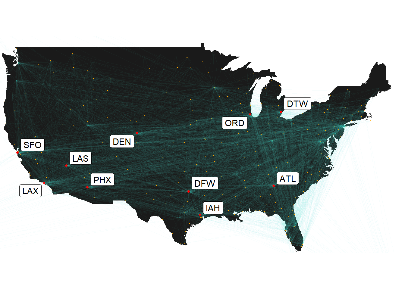
편의상 비행기가 자주 떠나는 출발지들을 추려서 분석을 진행했다. 우선 DB의 flights table에서 각각의 출발지와 목적지에 해당하는 항공편의 수를 집계하여 volume.origin.dest에 저장한 뒤 map_data()를 사용하여 실제 위치에 맞게 공항들과 노선들을 시각화했다. 비행기가 자주 떠나는 상위 10개의 출발지들은 geom_label_repel을 적용하여 이름을 붙였다.
head(x = volume.origin %>% left_join(airports, by = c("Origin" = "IATA")) %>% select(Origin, Name, n), n = 4)
## # A tibble: 4 x 3
##   Origin Name                                                   n
##   <chr>  <chr>                                              <int>
## 1 ATL    Hartsfield Jackson Atlanta International Airport 6744933
## 2 ORD    Chicago O'Hare International Airport             5674808
## 3 DFW    Dallas Fort Worth International Airport          4901453
## 4 LAX    Los Angeles International Airport                3866549
비행기가 가장 많이 떠나는 출발지들은 ATL(Hartsfield Jackson Atlanta International Airport), ORD(Chicago O’Hare International Airport), DRW(Dallas Fort Worth International Airport), LAX(Los Angeles International Airport)인 것으로 확인되었다. 이에 따라 이하 분석은 출발지가 ATL, ORD, DFW, LAX 중 하나에 해당하는 항공편에 한정했다.
delays.monthly = dplyr::tbl(con, "flights") %>%
  filter(Cancelled == 0, Origin %in% c("ATL", "ORD", "DFW", "LAX")) %>%
  group_by(Year, Month, Origin) %>%
  summarise(avg_arr_delay = mean(Arr_Delay[Arr_Delay > 0], na.rm = TRUE),
            avg_dep_delay = mean(Dep_Delay[Dep_Delay > 0], na.rm = TRUE)) %>%
  collect()
ggplot(data = filter(delays.monthly, Year > 2013)) +
  geom_line(mapping = aes(x = make_date(Year, Month, 1), y = avg_arr_delay, colour = "purple")) +
  geom_line(mapping = aes(x = make_date(Year, Month, 1), y = avg_dep_delay, colour = "orange")) +
  scale_x_date(date_labels = "%Y %b", date_breaks = "1 years") +
  theme(axis.text.x = element_text(angle = 45, size = 8)) +
  labs(x = "Date", y = "Average delays per month (min)") +
  facet_wrap(~ Origin) +
  scale_color_identity(name = "", breaks = c("purple", "orange"), labels = c("Arrival", "Departure"), guide = "legend") +
  theme(legend.position = "top")
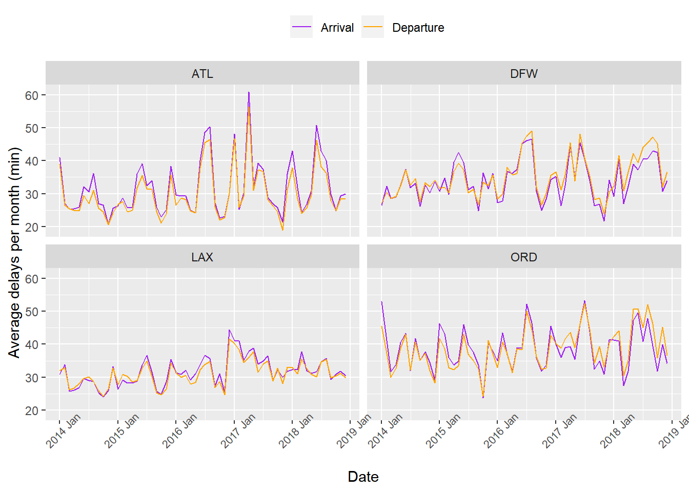
ATL, ORD, DFW, LAX에서 출발한 항공편들에 대해 월별 평균 지연 시간을 delays.monthly에 집계한 뒤 최근 4년간의 시간에 따른 변동을 출발지마다 시각화했다. 우선 평균 도착 지연 시간과 평균 출발 지연 시간에는 큰 차이가 없었고, 각각의 출발지마다 정점들이 찍히는 지점이 흡사했다. 다시 말해, 한여름과 12월 전후에 평균 지연 시간이 상승하는 양상이 공통적으로 관찰되었다. 따라서 평균 지연 시간을 각 달마다 플랏팅하면 1, 6, 7, 8, 11, 12월에 증가하는 형태일 것으로 예상할 수 있었다.
ggplot(data = delays.monthly %>% gather(avg_arr_delay, avg_dep_delay, key = "type", value = "avg_delay")) +
  geom_boxplot(mapping = aes(x = factor(Month), y = avg_delay, colour = type)) +
  scale_color_manual(values = c("purple", "orange"), label = c("Arrival", "Departure"), name = "") +
  labs(x = "Month", y = "Average delays per month (min)") +
  theme(legend.position = "top")
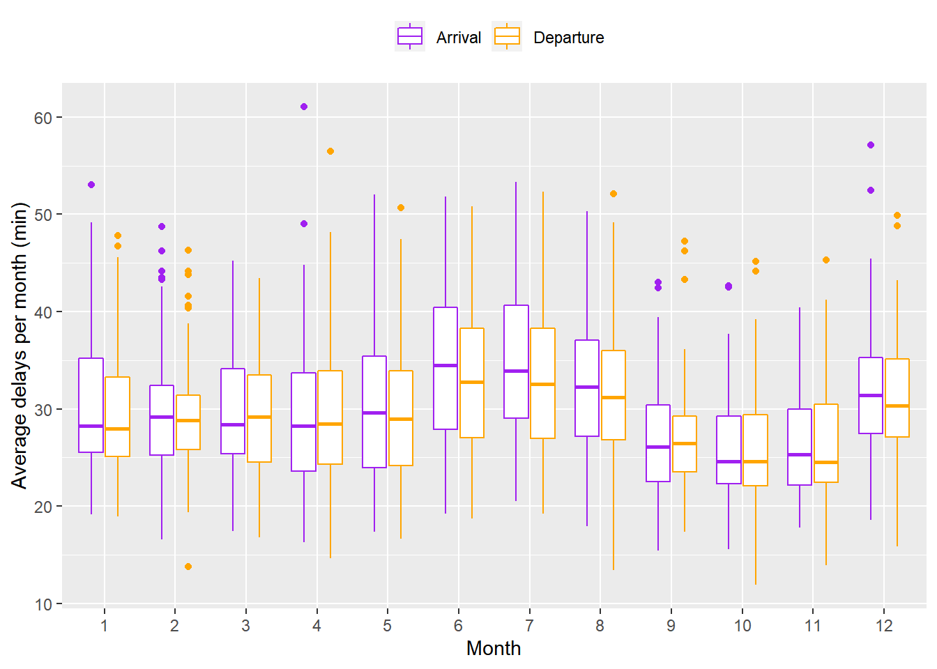
geom_boxplot()을 이용하여 달마다 월별 평균 지연 시간을 시각화한 결과 예상한 바와 같이 6, 7, 8월에 중간값과 IQR이 큰 것을 확인할 수 있었다. 9, 10, 11월은 중간값과 IQR이 뚜렷하게 작았지만, 위의 플랏에서 관찰한 바와 같이 12월 전후에 IQR이 크게 상승하지는 않았다. 따라서 여름을 6 ~ 8월, 가을을 9 ~ 11월, 나머지를 겨울에서 봄으로 정의하면 평균 지연 시간은 계절성을 가진다는 해석을 할 수 있다.
Q2. Do older planes suffer more delays?
Suggestions: you may want to find a correlation between the age of the plane and the departure delay. If the data size is too big to compute the correlation, you may try to sample a fraction from the dataset.
airplanes = dplyr::tbl(con, "airplanes") %>%
  collect()
planes.age = dplyr::tbl(con, "flights") %>%
  filter(Cancelled == 0) %>%
  select(Year, Month, Day_of_Month, CRS_Dep_Time, Tail_Num, Dep_Delay) %>%
  arrange(Dep_Delay) %>%
  filter(row_number() %% 100 == 0) %>%
  select(Year, Month, CRS_Dep_Time, Tail_Num, Dep_Delay) %>%
  collect()
term = function(month){
  if(month %in% c(6, 7, 8)){return("summer")}
  else if(month %in% c(9, 10, 11)){return("fall")}
  else{return("winter_to_spring")}
}
planes.age = planes.age %>%
  left_join(filter(airplanes, !is.na(Year), Year != "None", Year != 0), by = c("Tail_Num" ="TailNum")) %>%
  mutate(Term = map_chr(Month, term),
         Dep_Time = (as.integer(CRS_Dep_Time) %/% 100) %% 24,
         Plane_Age = as.integer(Year.x) - as.integer(Year.y)) %>%
  select(Term, Dep_Time, Plane_Age, Dep_Delay) %>%
  filter(Plane_Age >= 0, Dep_Time >= 5)
mod = lm(Dep_Delay ~ ns(Dep_Time, 3) + Term, data = planes.age)
plot4A = ggplot(data = planes.age %>% filter(Dep_Delay > 0)) +
  geom_hex(mapping = aes(x = Plane_Age, y = Dep_Delay)) +
  scale_fill_viridis_c(trans = "log10", name = "Number of flights") +
  scale_x_continuous(breaks = seq(0, 61, 5)) +
  scale_y_continuous(breaks = seq(0, 1800, 200)) +
  coord_cartesian(ylim = c(0, 1800)) +
  labs(x = "Plane age (year)", y = "Departure delays (min)", caption = "1/100 systematic sampling") +
  theme(legend.position = "top")
planes.age = add_residuals(mod, data = planes.age)
plot4B = ggplot(data = planes.age %>% filter(Dep_Delay > 0)) +
  geom_hex(mapping = aes(x = Plane_Age, y = resid)) +
  scale_fill_viridis_c(trans = "log10", name = "Number of flights") +
  scale_x_continuous(breaks = seq(0, 61, 5)) +
  scale_y_continuous(breaks = seq(0, 1800, 200)) +
  coord_cartesian(ylim = c(0, 1800)) +
  labs(x = "Plane age (year)", y = "Residuals of departure delays (min)", caption = "1/100 systematic sampling") +
  theme(legend.position = "top")
grid.arrange(plot4A, plot4B, nrow = 1)
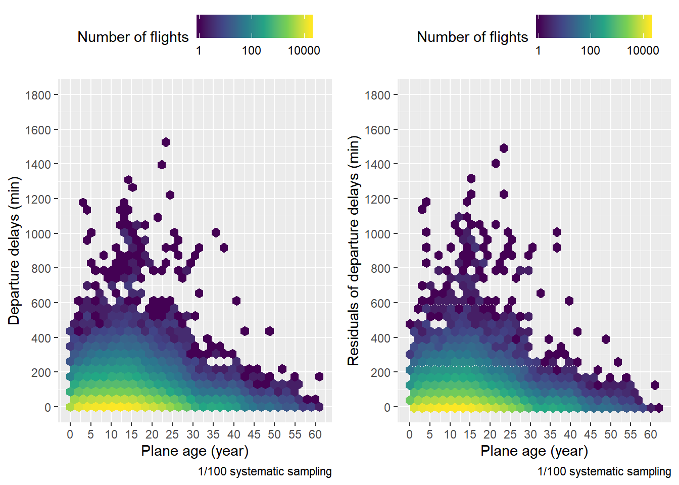
항공기의 연식과 출발 지연 시간에 대한 상관관계를 분석하기 전에 용량 제한 문제를 해결하기 위해서 DB의 flights table을 출발 지연 시간 순으로 정렬한 다음 $\frac{1}{100}$ 계통추출을 한 뒤 0시에서 5시 사이에 출발이 예정된 항공편은 제외하여 planes.age라는 샘플을 얻었다(0시에서 5시 사이에 출발이 예정된 항공편은 극히 적음을 1번 문제에서 확인했음). Ordered population에서는 계통추출을 통해 생성한 추정량이 단순임의추출을 통해 생성한 추정량에 비해 분산이 작다는 사실이 알려져 있기에 이와 같은 방법을 사용한 것이다. 앞선 분석에서 항공기의 출발 지연 시간은 출발 예정 시각, 요일, 계절에 영향을 받는다는 것을 확인했다. 따라서 상관관계를 정확하게 파악하기 위해서는 출발 예정 시각, 요일, 계절에 의한 영향을 제거해야 한다. 요일의 영향은 상대적으로 미미하기 때문에 나머지 두 변수를 통해 출발 지연 시간을 설명하는 model인 mod를 생성했다. 계절은 범주형 변수이지만, 출발 예정 시각은 연속형 변수이다. 1번 문제에서 출발 예정 시각에 따른 출발 지연 시간은 10시와 20시에 극점을 찍기 때문에 단순한 lm이 아니라 splines::ns()를 적용했다. 항공기의 연식과 출발 지연 시간에 대한 일반적인 플랏과 출발 예정 시각, 계절에 의한 영향을 제거한 플랏을 생성한 결과 두 경우 전부 지연 시간이 0 부근인 라인에서 항공기 연식 15년을 전후하여 색이 변하는 양상이 뒤집힘을 관찰할 수 있었다(항공편의 수가 증가했다 다시 줄어듦).
quantile(planes.age$Plane_Age, probs = 0.90)
planes.age.1 = planes.age %>%
  filter(Plane_Age < 15) %>%
  group_by(Plane_Age) %>%
  summarise(n = n(), avg_dep_delay = mean(resid[resid > 0], na.rm = TRUE))
planes.age.2 = planes.age %>%
  filter(Plane_Age > 14, Plane_Age < 22) %>%
  group_by(Plane_Age) %>%
  summarise(n = n(), avg_dep_delay = mean(resid[resid > 0], na.rm = TRUE))
mod.1 = lm(avg_dep_delay ~ Plane_Age, data = planes.age.1, weights = n)
mod.2 = lm(avg_dep_delay ~ Plane_Age, data = planes.age.2, weights = n)
grid.1 = planes.age.1 %>%
  data_grid(Plane_Age) %>%
  add_predictions(mod.1)
grid.2 = planes.age.2 %>%
  data_grid(Plane_Age) %>%
  add_predictions(mod.2)
plot4C = ggplot(data = planes.age.1) +
  geom_point(mapping = aes(x = Plane_Age, y = avg_dep_delay, size = `n`), colour = "orange") +
  geom_line(data = grid.1, mapping = aes(x = Plane_Age, y = pred)) +
  scale_x_continuous(breaks = seq(0, 14, 1)) +
  scale_size_continuous(name = "Number of flights") +
  coord_cartesian(ylim = c(32, 41)) +
  annotate("text", x = 7, y = 40, label = expression(paste(R^{2}, " = 0.934507"))) +
  labs(x = "Plane age (year)", y = "Residuals of average\ndeparture delays (min)", caption = "1/100 systematic sampling")
plot4D = ggplot(data = planes.age.2) +
  geom_point(mapping = aes(x = Plane_Age, y = avg_dep_delay, size = `n`), colour = "orange") +
  geom_line(data = grid.2, mapping = aes(x = Plane_Age, y = pred)) +
  scale_x_continuous(breaks = seq(15, 24, 1)) +
  scale_size_continuous(name = "Number of flights") +
  coord_cartesian(ylim = c(34, 41)) +
  annotate("text", x = 18, y = 40, label = expression(paste(R^{2}, " = 0.9917637"))) +
  labs(x = "Plane age (year)", y = "Residuals of average\ndeparture delays (min)", caption = "1/100 systematic sampling")
grid.arrange(plot4C, plot4D, nrow = 2)
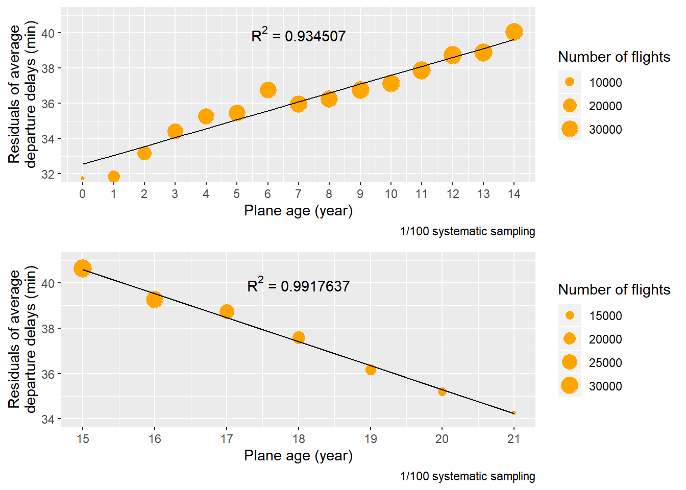
90%의 항공기가 연식이 21년 이하이기 때문에 연식이 21년 이하인 항공기에 대해서 연식 15년을 기준으로 planes.age을 planes.age.1과 planes.age.2로 분리한 다음 각각에 대해 가중 선형 회귀분석을 수행했다(가중치는 항공편의 수). 연식이 15년 미만인 항공기들에 대해서는 연식과 출발 지연 시간에 강한 양의 선형 관계가 있었다. 반면 연식이 15년 이상인 항공기들에 대해서는 연식과 출발 지연 시간에 강한 음의 선형 관계가 있었다. 이와 같은 결과가 나타난 한 가지 가능한 이유는 항공기가 운항을 시작한 이후에 결함들이 쌓이면서 출발 지연 시간이 늘어나다가 중간에 정비를 받아서 다시 줄어들기 때문일 것으로 추측된다.
dbDisconnect(con)